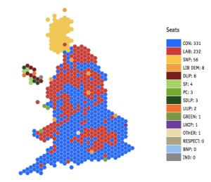
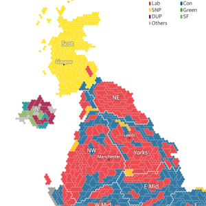
After the recent Parliamentary elections in the United Kingdom, The Economist [1] posted a map showing election results with each of the 650 seats in the House of Commons shown as a hexagon. [2] The hexagons caught my attention because they reminded me of a misspent youth in role-playing games where maps based on hexagons made a regular appearance (“Nerds!”). Maps where political subdivisions of different size are given equal ink (or pixels) can reveal trends that would otherwise be obscured in urban areas.
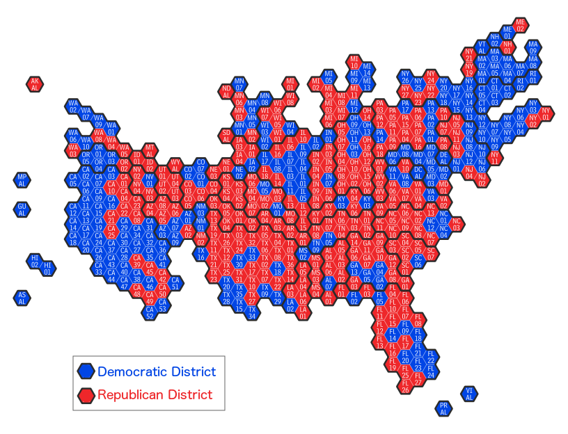
I was able to create a similar shape file that gives equal weight to each of the districts in the U.S. House of Representatives:

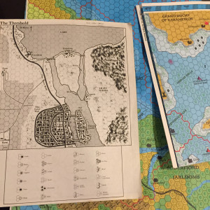
A constituency in the UK is roughly analogous to the 435 Congressional Districts in the US House of Representatives. And like districts in the US, constituencies in the UK contain roughly the same number of “electors” (in the US: “constituents”).
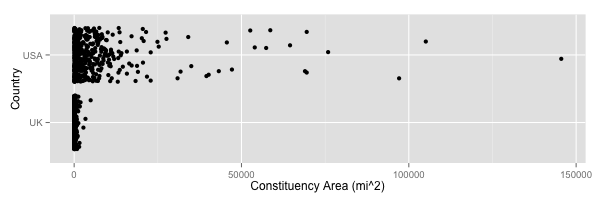
Constituencies and districts come in vastly different shapes and sizes because population density varies across both countries. For example, in the UK, Dumfries and Galloway Co. Const., the 6th largest constituency is 1,602.4 sq. mi. while the smallest, Islington North Boro. Const., is 2.85 sq. mi.[4] In the US, KS-01—the sixth largest non-at-large district—has an area of 57,373.20 sq. mi. compared to NY-15, the smallest district in Congress, with 10.29 sq. mi. The difference in land area between the US and UK constituencies is huge. [5]
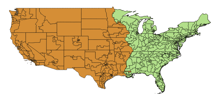
A problem that I have encountered in mapping congressional data is that many districts become invisible on web and Power Point images because many districts have very small land areas. For example:
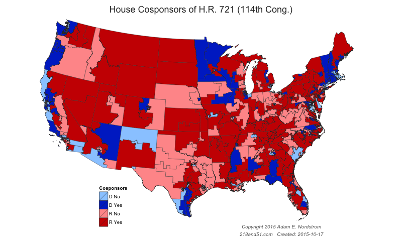
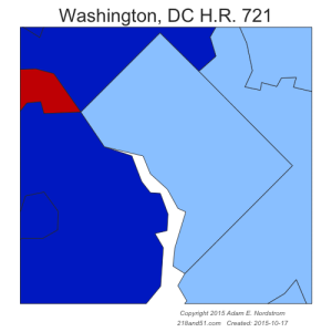
On my US district maps shown here, I can only discern about 300 of the 433 on this map without the need for additional magnification.[6]
The Economist map solves this problem by displaying each constituency in an equal area – a hexagon.[7] This gives each constituency an equal weight in the viewer’s eye. Each constituency/district has the same voice in the House, why shouldn’t it have the same weight on the graphic? The Economist map allows the change in every constituency to be seen.
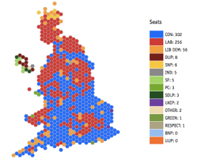

“Can the same technique be used in the US?” The answer is yes, but two big challenges popped up immediately:
- The House of Commons has 650 constituencies to cover a landmass of 94,058 sq. mi. The U.S. has 435 voting districts and 3,805,927 sq. mi. The US is a mere 40 times the size of the UK. The average UK constituency is 145 sq. mi., while the average US district is 8,749 sq. mi. The Economist’s map therefore has an easier time preserving the shape of the islands and relative position of the districts because the UK has more polygons to work with over a smaller area.
- There are only four major country divisions of the UK (England, Scotland, Wales, and N. Ireland) while there are 50 states. A US map should not only show individual districts, but also represent all 50 states. Scotland is the most rural of the four countries[8], and Scotland and England to need only connect across along a few hexagon sides so differences in relative scale between England and Scotland can be accommodated easily. By comparison, the very rural US plains states will lack sufficient polygons to connect the populous Atlantic and Pacific coasts while maintaining connection between the common borders of those states. Some difficult choices will have to be made when placing the US states and districts.
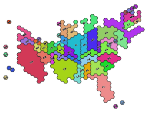
I am pleased to post my shapefile here in a zipped format. It is formatted for the Congressional districts of the 114th Congress as of November 4, 2015 after Speaker Boehner’s retirement.
The Daily Kos and Guardian maps are nice compromises between equal area and geographic accuracy. But I still prefer The Economist’s cleaner approach of a single hex per datapoint.
Hex maps provide some advantages to geographically accurate maps. Each district is important because each district has one Representative in Congress. Montana or Alaska’s vote counts the same as NYC east of the Harlem River and south of Fordham. Disproportionate ink for an equivalent datapoint risks misinterpretation of the data. Plotting maps that are geographically accurate obscure these trends because important differences among parties and voting blocs occur between rural and urban areas.
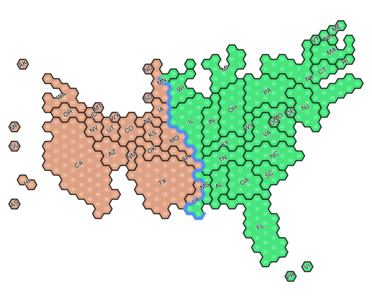
Comparing this to an “accurate” map shows that much much more of the surface area is west of the Mississippi, and so the political influence of the east is hidden in the geographically accurate maps.
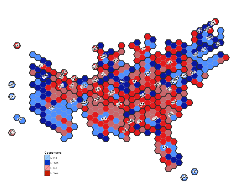
Another example is the cosponsorship data shown above for a sample House bill. 247 Representatives have cosponsored H.R. 721, but the distribution of cosponsorships is distorted by the geographic data. More worrying is the fact that the accurate map obscures the lower number of urban districts which are not yet cosponsors of the bill (for example, LA, SF, NYC, Phoenix).
Compare this to the “accurate” map shown below.

The “accurate” map seems to overstate the breadth of support, while obscuring points of where more work is required such as Democrats in NYC and California, and Republicans in the south and Ohio.
# 30 #
Notes:
[1] http://www.economist.com/ukelection2015
[2] The House of Commons is a representative democratic institution in which each of the 650 MPs represents a geographically defined “constituency.” http://www.ons.gov.uk/ons/guide-method/geography/beginner-s-guide/electoral/westminster-parliamentary-constituencies/index.html
[3] With apologies to non-Imperial measurement users who live inside the Empire, to convert sq. mi. to sq. km.: mi2 × 2.59 = km2.
[4] Calculated using QGIS and the Ordnance Survey “Boundary-Line”TM shape file available at https://www.ordnancesurvey.co.uk/opendatadownload/products.html. I was very surprised that this data did not readily pop up after a couple Google searches. I did not carefully check the Ordnance Survey map for things like water bodies that occasionally screw up land area calculations on US state and district GIS files that often—unfortunately—include territorial waters and large lakes within district polygons. Dumfries and Galloway Co Const = 415,030.334 Hectares, or 1,602.4 sq. mi.; Islington North Boro Const = 738.038 hectares, or 2.85 sq. mi.. 1 sq. mi. = 259 hectares.
[5] https://en.wikipedia.org/wiki/List_of_United_States_congressional_districts Unfortunately I think this table is a little out of date with current lines.
[6] A very useful, zoomable, implementation of US Congressional district maps is GovTrack’s Google Map: https://www.govtrack.us/congress/members/map
[7] The hexagon is a good choice. There are three possible Euclidean tilings using regular polygons composed of equal angles and equal sides: equilateral triangles, squares (think: graph paper), and hexagons (think: fantasy role playing maps). See: https://en.wikipedia.org/wiki/List_of_regular_polytopes_and_compounds#Euclidean_tilings for a cool graphics-heavy representation of tilings and polytopes. Equilateral triangles can share sides with three neighbors (not counting the three neighbors with only vertices in common); squares four, and hexagons six. Hexagons meet all their neighbors at sides, while triangles and squares meet half their neighbors at vertices. In board games the question often arises: “Is a diagonal move legal?” The distance from the center of a square tile to the center of a tile located diagonally is 1.4x as far as the distance to the center of a square in the cardinal directions. This leads to greater distortion over diagonal distances than the hexagon. An interesting discussion of the challenges this faces when using isometric tiles in computer programming is here. http://www.gamedev.net/page/resources/_/technical/game-programming/isometric-n-hexagonal-maps-part-i-r747 The distance to the center of all six neighbors of one hexagon is equal. Anyone who played role-playing games in the 1980s and 90s remembers the value of tiled hexagon maps for measuring distances; an innovation attributed to Avalon Hill games at the above link.
[8] Scotland: 30,090 mi2 with a population density of 174.1/mi2; compared with England: area: 50,301 mi2, density: 1,054.1/mi2; Wales: 8,022 mi2; 381/mi2; and N. Ireland: 5,456 mi2, 339/mi2.
A couple additional thoughts:
If there is an easy way to automate the process of creating hex maps from existing maps, I couldn’t find it. I used Michael Minn’s MMQGIS plugin for QGIS to render my own hex graph paper (Elminister eat your heart out). I fooled around rendering—with paper and pen—the districts within each state in an effort to maintain a suggestion of the state’s shape using hexagons, and then made several drafts combining the 50 state hexagon groups into something suggesting the outline of the United States.


